ANA RITA DE ALBUQUERQUE
︎︎︎VISUAL IDENTITY

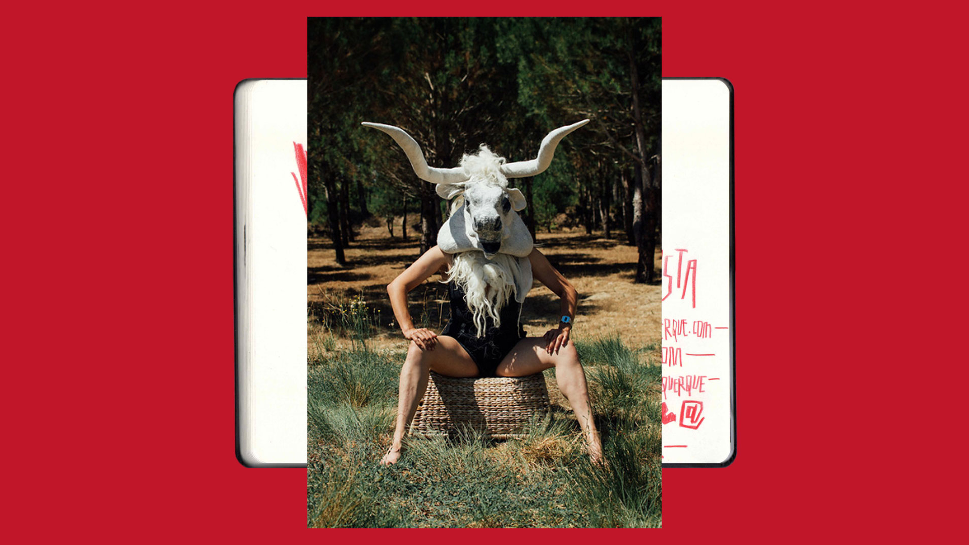
The process started by exploring calligraphy and some drawings representing the «Artist Animal». The inverted «A» reflects the idea of a beast's head, a theme in part of Ana Rita's work. The idea was to design a logo that wouldn't overshadow the artist and was easy to use on felted wool, her media of choice.
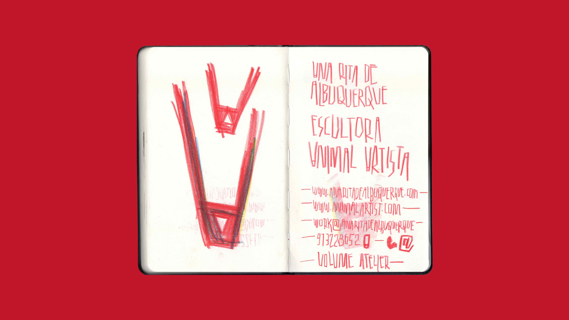
︎︎︎Sketches exploring the idea of «Artist Animal»

︎︎︎ The red colour was present since the first skecthes

︎︎︎ Another artist’s work used to define the colour scheme
Developed with Ofício
Client: Ana Rita de Albuquerque
Graphic Design: Miguel Moreira
Drawings: Miguel Moreira
Photography: Miguel Barbot
Typography: Usual by R-Typography
︎︎︎MORE PROJECTS
︎︎︎design@miguelmoreira.com
︎︎︎design@miguelmoreira.com