OFICIO
︎︎︎LOGOTYPE
︎︎︎CUSTOM TYPE

The first pencil sketch had a loose uncompromised style and was very expressive. I tried to keep the same look and feel when vectorising. In Portuguese, the word Ofício means «labour, craft or a profession» has this accent in the «i». I stylised this letter to solve a loose element and add some personality to the logo
︎︎︎From sketch to the vectorized logo
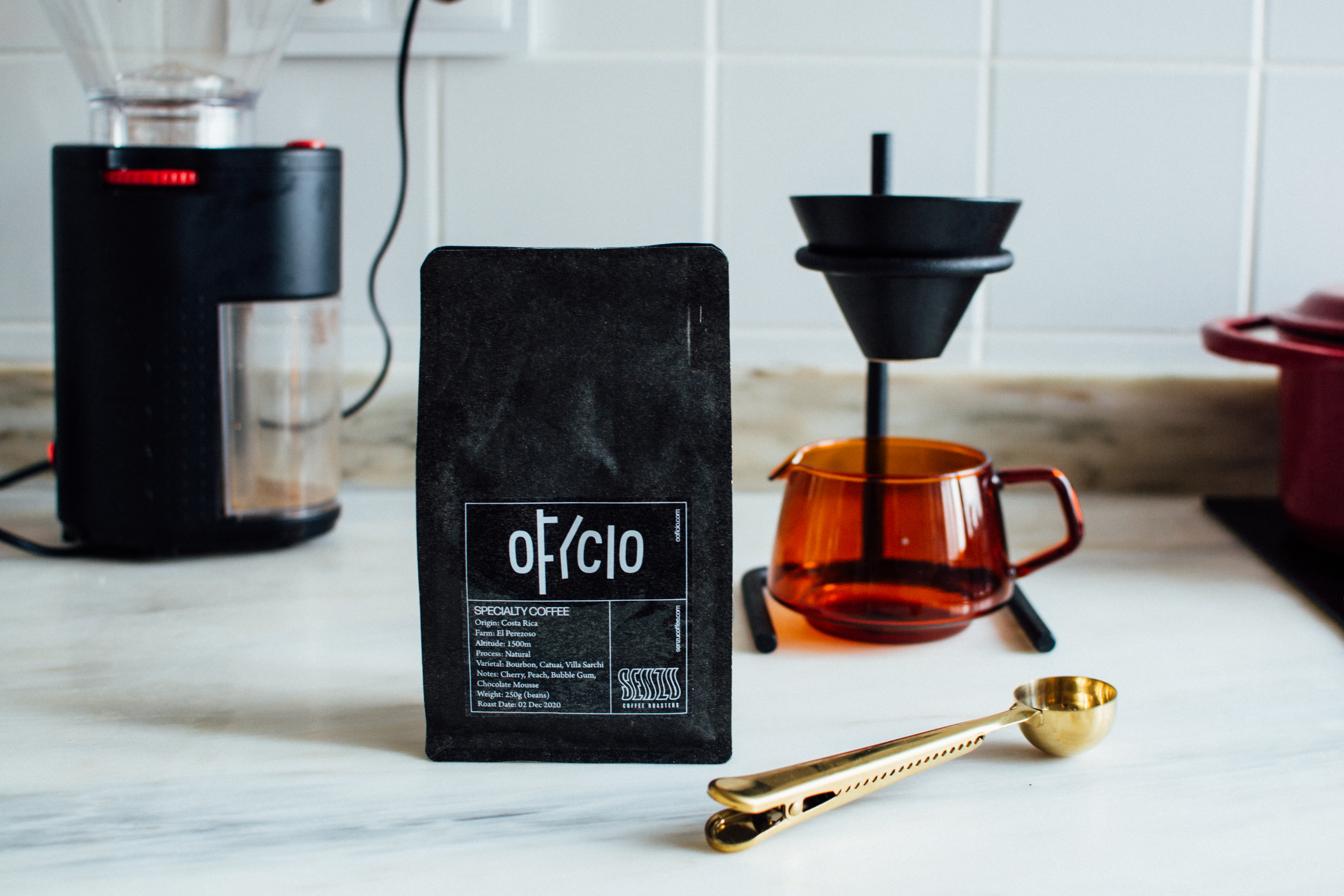
︎︎︎A special edition of Ofício coffee with Senzu Coffee Roasters

Developed with Ofício
Client: Ofício
Graphic Design: Miguel Moreira
Drawings: Miguel Moreira
Photography: Miguel Barbot
Typography: Custom Typography
︎︎︎MORE PROJECTS
︎︎︎design@miguelmoreira.com
︎︎︎design@miguelmoreira.com